# Clay
Clay is a JavaScript library that makes it easy to add offline configuration pages to your Pebble apps. All you need to get started is a couple lines of JavaScript and a JSON file; no servers or HTML required.
Clay will by default automatically handle the 'showConfiguration' and 'webviewclosed' events traditionally implemented by developers to relay configuration settings to the watch side of the app. This step is not required when using Clay, since each config item is given the same `appKey` as defined in `appinfo.json` (or PebbleKit JS Message Keys on CloudPebble), and is automatically transmitted once the configuration page is submitted by the user. Developers can override this behavior by [handling the events manually](#handling-the-showconfiguration-and-webviewclosed-events-manually).
**Clay is still in early development and may be missing some features. We would love your feedback! Pease submit any ideas or features via GitHub Issues.**
# Getting Started (SDK)
Clay will eventually be built into the Pebble SDK. However, while it is still in beta you will need to follow the steps shown below:
1. Download the **clay.js** distribution file from the [latest release](https://github.com/pebble/clay/releases/latest).
2. Drop `clay.js` in your project's `src/js` directory.
3. Create a JSON file called `config.json` and place it in your `src/js` directory.
4. In order for JSON files to work you may need to change a line in your `wscript` from `ctx.pbl_bundle(binaries=binaries, js=ctx.path.ant_glob('src/js/**/*.js'))` to `ctx.pbl_bundle(binaries=binaries, js=ctx.path.ant_glob(['src/js/**/*.js', 'src/js/**/*.json']))`.
5. Your `app.js` file needs to `require` clay and your config file, then be initialized. Clay will by default automatically handle the 'showConfiguration' and 'webviewclosed' events. Copy and paste the following into the top of your `app.js` file:
```javascript
var Clay = require('clay');
var clayConfig = require('config.json');
var clay = new Clay(clayConfig);
```
6. Next is the fun part - creating your config page. Edit your `config.js` file to build a layout of elements as described in the sections below.
# Getting Started (CloudPebble)
Clay will eventually be built into CloudPebble. However while it is still in beta, you will need to follow some steps.
NOTE these are similar to using the SDK but instead of a data file called config.json, a javascript file config.js is required.
1. Create a new JavaScript file called `clay.js`.
2. Copy the contents from the **clay.js** distribution file found in the [latest release](https://github.com/pebble/clay/releases/latest) into your newly created `clay.js` file.
3. Create another JavaScript file called `config.js` with the following content. This will act as your config's root array element, from which the rest of the page is built up:
```javascript
module.exports = [];
```
4. Your `app.js` file needs to `require` clay and your config file, then be initialized. Clay will by default automatically handle the 'showConfiguration' and 'webviewclosed' events. Copy and paste the following into the top of your `app.js` file:
```javascript
var Clay = require('clay');
var clayConfig = require('config');
var clay = new Clay(clayConfig);
```
5. Next is the fun part - creating your config page. Edit your `config.js` file to build a layout of elements as described in the sections below.
# Creating Your Config File
Clay uses JavaScript object notation (or JSON) to generate the config page for you. The structure of the page is up to you, but you do need to follow some basic rules.
## Basic Config Structure
Your root element **must** be an array. This represents the entire page. Inside this array you place your config items. Each config item is an object with some properties that configure how each item should be displayed.
#### Example
NOTE for config.js (rather than config.json) a leading `module.exports =` is required.
```javascript
[
{
"type": "heading",
"defaultValue": "Example Header Item"
},
{
"type": "text",
"defaultValue": "Example text item."
}
]
```
## Components
### Section
Sections help divide up the page into logical groups of items. It is recommended that you place all your input-based items in at least one section.
##### Properties
| Property | Type | Description |
|----------|------|-------------|
| type | string | Set to `section`. |
| items | array | Array of items to include in this section. |
##### Example
```javascript
{
"type": "section",
"items": [
{
"type": "heading",
"defaultValue": "This is a section"
},
{
"type": "input",
"appKey": "email",
"label": "Email Address"
},
{
"type": "toggle",
"appKey": "enableAnimations",
"label": "Enable Animations"
}
]
}
```
---
### Heading
**Manipulator:** [`html`](#html)
Headings can be used in anywhere and can have their size adjusted to suit the context. If you place a heading item at the first position of a section's `items` array then it will automatically be styled as the header for that section.
##### Properties
| Property | Type | Description |
|----------|------|-------------|
| type | string | Set to `heading`. |
| id | string (unique) | Set this to a unique string to allow this item to be looked up using `Clay.getItemsById()` in your [custom function](#custom-function). |
| appKey | string (unique) | The AppMessage key matching the `appKey` item defined in your `appinfo.json`. Set this to a unique string to allow this item to be looked up using `Clay.getItemsByAppKey()` in your custom function. You must set this if you wish for the value of this item to be persisted after the user closes the config page. |
| defaultValue | string/HTML | The heading's text. |
| size | int | Defaults to `4`. An integer from 1 to 6 where 1 is the largest size and 6 is the smallest. (represents HTML `
`, `
`, `
`, etc). |
##### Example
```javascript
{
"type": "heading",
"id": "main-heading",
"defaultValue": "My Cool Watchface",
"size": 1
}
```
---
### Text
**Manipulator:** [`html`](#html)
Text is used to provide descriptions of sections or to explain complex parts of your page. Feel free to add any extra HTML you require to the `defaultValue`
##### Properties
| Property | Type | Description |
|----------|------|-------------|
| type | string | Set to `text`. |
| id | string (unique) | Set this to a unique string to allow this item to be looked up using `Clay.getItemsById()` in your [custom function](#custom-function). |
| appKey | string (unique) | The AppMessage key matching the `appKey` item defined in your `appinfo.json`. Set this to a unique string to allow this item to be looked up using `Clay.getItemsByAppKey()` in your custom function. You must set this if you wish for the value of this item to be persisted after the user closes the config page. |
| defaultValue | string/HTML | The content of the text element. |
##### Example
```javascript
{
"type": "text",
"defaultValue": "This will be displayed in the text element!",
}
```
---
### Input
**Manipulator:** [`val`](#val)
Standard text input field.
##### Properties
| Property | Type | Description |
|----------|------|-------------|
| type | string | Set to `input`. |
| id | string (unique) | Set this to a unique string to allow this item to be looked up using `Clay.getItemsById()` in your [custom function](#custom-function). |
| appKey | string (unique) | The AppMessage key matching the `appKey` item defined in your `appinfo.json`. Set this to a unique string to allow this item to be looked up using `Clay.getItemsByAppKey()` in your custom function. You must set this if you wish for the value of this item to be persisted after the user closes the config page. |
| label | string | The label that should appear next to this item. |
| defaultValue | string | The default value of the input field. |
| description | string | Optional sub-text to include below the component |
| attributes | object | An object containing HTML attributes to set on the input field. You can add basic HTML5 validation this way by setting attributes such as `required` or `type`. |
##### Example
```javascript
{
"type": "input",
"appKey": "email",
"defaultValue": "",
"label": "Email Address",
"attributes": {
"placeholder": "eg: name@domain.com",
"limit": 10,
"required": "required",
"type": "email"
}
}
```
---
#### Toggle
**Manipulator:** [`checked`](#checked)
Switch for a single item.
##### Properties
| Property | Type | Description |
|----------|------|-------------|
| type | string | Set to `toggle`. |
| id | string (unique) | Set this to a unique string to allow this item to be looked up using `Clay.getItemsById()` in your [custom function](#custom-function). |
| appKey | string (unique) | The AppMessage key matching the `appKey` item defined in your `appinfo.json`. Set this to a unique string to allow this item to be looked up using `Clay.getItemsByAppKey()` in your custom function. You must set this if you wish for the value of this item to be persisted after the user closes the config page. |
| label | string | The label that should appear next to this item. |
| defaultValue | int\|boolean | The default value of the toggle. Defaults to `false` if not specified. |
| description | string | Optional sub-text to include below the component |
| attributes | object | An object containing HTML attributes to set on the input field. You can add basic HTML5 validation this way by setting attribute such as `required`. |
##### Example
```javascript
{
"type": "toggle",
"appKey": "invert",
"label": "Invert Colors",
"defaultValue": true,
"attributes": {
"required": "required"
}
}
```
---
#### Select
**Manipulator:** [`val`](#val)
A dropdown menu containing multiple options.
##### Properties
| Property | Type | Description |
|----------|------|-------------|
| type | string | Set to `select`. |
| id | string (unique) | Set this to a unique string to allow this item to be looked up using `Clay.getItemsById()` in your [custom function](#custom-function). |
| appKey | string (unique) | The AppMessage key matching the `appKey` item defined in your `appinfo.json`. Set this to a unique string to allow this item to be looked up using `Clay.getItemsByAppKey()` in your custom function. You must set this if you wish for the value of this item to be persisted after the user closes the config page. |
| label | string | The label that should appear next to this item. |
| defaultValue | string | The default value of the dropdown menu. Must match a value in the `options` array. |
| description | string | Optional sub-text to include below the component |
| attributes | object | An object containing HTML attributes to set on the input field. You can add basic HTML5 validation this way by setting attribute such as `required`. |
| options | array of objects | The options you want to appear in the dropdown menu. Each option is an object with a `label` and `value` property. |
##### Example
```javascript
{
"type": "select",
"appKey": "flavor",
"defaultValue": "grape",
"label": "Favorite Flavor",
"options": [
{
"label": "",
"value": ""
},
{
"label": "Berry",
"value": "berry"
},
{
"label": "Grape",
"value": "grape"
},
{
"label": "Banana",
"value": "banana"
}
],
"attributes": {
"required": "required"
}
}
```
---
#### Color
**Manipulator:** [`color`](#color)
A color picker containing the 64 supported colors on Basalt and Chalk.
##### Properties
| Property | Type | Description |
|----------|------|-------------|
| type | string | Set to `color`. |
| id | string (unique) | Set this to a unique string to allow this item to be looked up using `Clay.getItemsById()` in your [custom function](#custom-function). |
| appKey | string (unique) | The AppMessage key matching the `appKey` item defined in your `appinfo.json`. Set this to a unique string to allow this item to be looked up using `Clay.getItemsByAppKey()` in your custom function. You must set this if you wish for the value of this item to be persisted after the user closes the config page. |
| label | string | The label that should appear next to this item. |
| defaultValue | string OR int | The default color. Always use the uncorrected value even if `sunlight` is true. The component will do the conversion internally. |
| description | string | Optional sub-text to include below the component |
| sunlight | boolean | Use the color-corrected sunlight color palette if `true`, else the uncorrected version. Defaults to `true` if not specified. |
##### Example
```javascript
{
"type": "color",
"appKey": "background",
"defaultValue": "FF0000",
"label": "Background Color",
"sunlight": true
}
```
---
#### Radio Group
**Manipulator:** [`radiogroup`](#radiogroup)
A list of options allowing the user can only choose one option to submit.
##### Properties
| Property | Type | Description |
|----------|------|-------------|
| type | string | Set to `radiogroup`. |
| id | string (unique) | Set this to a unique string to allow this item to be looked up using `Clay.getItemsById()` in your [custom function](#custom-function). |
| appKey | string (unique) | The AppMessage key matching the `appKey` item defined in your `appinfo.json`. Set this to a unique string to allow this item to be looked up using `Clay.getItemsByAppKey()` in your custom function. You must set this if you wish for the value of this item to be persisted after the user closes the config page. |
| label | string | The label that should appear next to this item. |
| defaultValue | string | The default selected item. Must match a value in the `options` array. |
| description | string | Optional sub-text to include below the component |
| attributes | object | An object containing HTML attributes to set on the input field. You can add basic HTML5 validation this way by setting attribute such as `required`. |
| options | array of objects | The options you want to appear in the radio group. Each option is an object with a `label` and `value` property. |
##### Example
```javascript
{
"type": "radiogroup",
"appKey": "favorite_food",
"label": "Favorite Food",
"options": [
{
"label": "Sushi",
"value": "sushi"
},
{
"label": "Pizza",
"value": "pizza"
},
{
"label": "Burgers",
"value": "burgers"
}
]
}
```
---
#### Checkbox Group
**Manipulator:** [`checkboxgroup`](#checkboxgroup)
A list of options where a user may choose more than one option to submit.
##### Properties
| Property | Type | Description |
|----------|------|-------------|
| type | string | Set to `checkboxgroup`. |
| id | string (unique) | Set this to a unique string to allow this item to be looked up using `Clay.getItemsById()` in your [custom function](#custom-function). |
| appKey | string (unique) | The AppMessage key matching the `appKey` item defined in your `appinfo.json`. Set this to a unique string to allow this item to be looked up using `Clay.getItemsByAppKey()` in your custom function. You must set this if you wish for the value of this item to be persisted after the user closes the config page. |
| label | string | The label that should appear next to this item. |
| defaultValue | array of strings | The default selected items. Each value must match one in the `options` array. |
| description | string | Optional sub-text to include below the component |
| attributes | object | An object containing HTML attributes to set on the input field. You can add basic HTML5 validation this way by setting attribute such as `required`. |
| options | array of objects | The options you want to appear in the checkbox group. Each option is an object with a `label` and `value` property. |
##### Example
```javascript
{
"type": "checkboxgroup",
"appKey": "favorite_food",
"label": "Favorite Food",
"defaultValue": ["sushi", "burgers"],
"options": [
{
"label": "Sushi",
"value": "sushi"
},
{
"label": "Pizza",
"value": "pizza"
},
{
"label": "Burgers",
"value": "burgers"
}
]
}
```
---
### Generic Button
**Manipulator:** [`button`](#button)
##### Properties
| Property | Type | Description |
|----------|------|-------------|
| type | string | Set to `button`. |
| defaultValue | string | The text displayed on the button. |
| primary | boolean | If `true` the button will be orange, if `false`, the button will be gray (defaults to `false`)|
| attributes | object | An object containing HTML attributes to set on the input field. |
| description | string | Optional sub-text to include below the component |
##### Example
```javascript
{
"type": "button",
"primary": true,
"defaultValue": "Send"
}
```
---
### Range Slider
**Manipulator:** [`slider`](#slider)
The range slider is used to allow users to select numbers between two values.
**NOTE** If you set the `step` property to anything less than `1`,
it will multiply the final value sent to the watch by 10 to the power of the number of decimal places in the value of `step`.
Eg: If you set the `step` to `0.25` and the slider has value of `34.5`, the watch will receive `3450`.
The reason why this is necessary, is because you can not send floats to the watch via `Pebble.sendAppMessage()`.
This allows your users to still be able to input values that have decimals,
you must just remember to divide the received value on the watch accordingly.
##### Properties
| Property | Type | Description |
|----------|------|-------------|
| type | string | Set to `slider`. |
| defaultValue | number | The value of the slider. |
| label | string | The label that should appear next to this item. |
| min | number | The minimum allowed value of the slider. Defaults to `100` |
| max | number | The maximum allowed value of the slider. Defaults to `0` |
| step | number | The multiple of the values allowed to be set on the slider. The slider will snap to these values. This value also determines the precision used when the value is sent to the watch. Defaults to 1 |
| attributes | object | An object containing HTML attributes to set on the input field. |
| description | string | Optional sub-text to include below the component |
##### Example
```javascript
{
"type": "slider",
"appKey": "slider",
"defaultValue": 15,
"label": "Slider",
"description": "This is the description for the slider",
"min": 10,
"max": 20,
"step": 0.25
},
```
---
### Submit
**Manipulator:** [`button`](#button)
The submit button for the page. You **MUST** include this component somewhere in the config page (traditionally at the bottom) or users will not be able to save the form.
##### Properties
| Property | Type | Description |
|----------|------|-------------|
| type | string | Set to `submit`. |
| defaultValue | string | The text displayed on the button. |
| attributes | object | An object containing HTML attributes to set on the input field. |
##### Example
```javascript
{
"type": "submit",
"defaultValue": "Save"
}
```
---
### Coming Soon
- Tabs
- Footer
- Dynamic + draggable list
---
## Manipulators
Each component has a **manipulator**. This is a set of methods used to talk to the item on the page.
At a minimum, manipulators must have a `.get()` and `.set(value)` method however there are also methods to assist in interactivity such as `.hide()` and `.disable()`.
**NOTE:** There is currently no way to disable or hide an entire section. You must disable/hide each item in the section to achieve this effect.
When the config page is closed, the `.get()` method is run on all components registered with an `appKey` to construct the object sent to the C app.
Many of these methods fire an event when the method is called. You can listen for these events with `ClayItem.on()`.
**NOTE** These events will only be fired if the state actually changes.
Eg: If you run the `.show()` manipulator on an item that is already visible, the `show` event will not be triggered.
#### html
| Method | Returns | Event Fired | Description |
|--------|---------|-------------| ------------|
| `.set( [string\|HTML] value)` | `ClayItem` | `change` | Sets the content of this item. |
| `.get()` | `string` | | Gets the content of this item. |
| `.hide()` | `ClayItem` | `hide` | Hides the item |
| `.show()` | `ClayItem` | `show` | Shows the item |
#### button
| Method | Returns | Event Fired | Description |
|--------|---------|-------------| ------------|
| `.set( [string\|HTML] value)` | `ClayItem` | `change` | Sets the content of this item. |
| `.get()` | `string` | | Gets the content of this item. |
| `.disable()` | `ClayItem` | `disabled` | Prevents this item from being clicked by the user. |
| `.enable()` | `ClayItem` | `enabled` | Allows this item to be clicked by the user. |
| `.hide()` | `ClayItem` | `hide` | Hides the item |
| `.show()` | `ClayItem` | `show` | Shows the item |
#### val
| Method | Returns | Event Fired | Description |
|--------|---------|-------------| ------------|
| `.set( [string] value)` | `ClayItem` | `change` | Sets the value of this item. |
| `.get()` | `string` | | Gets the content of this item. |
| `.disable()` | `ClayItem` | `disabled` | Prevents this item from being edited by the user. |
| `.enable()` | `ClayItem` | `enabled` | Allows this item to be edited by the user. |
| `.hide()` | `ClayItem` | `hide` | Hides the item |
| `.show()` | `ClayItem` | `show` | Shows the item |
#### checked
| Method | Returns | Event Fired | Description |
|--------|---------|-------------| ------------|
| `.set( [boolean\|int] value)` | `ClayItem` | `change` | Check/uncheck the state of this item. |
| `.get()` | `boolean` | | `true` if checked, `false` if not. **NOTE** this will be converted to a `1` or `0` when sent to the watch. See [`Clay.getSettings()`](#methods) |
| `.disable()` | `ClayItem` | `disabled` | Prevents this item from being edited by the user. |
| `.enable()` | `ClayItem` | `enabled` | Allows this item to be edited by the user. |
| `.hide()` | `ClayItem` | `hide` | Hides the item |
| `.show()` | `ClayItem` | `show` | Shows the item |
#### color
| Method | Returns | Event Fired | Description |
|--------|---------|-------------| ------------|
| `.set( [string\|int] value)` | `ClayItem` | `change` | Sets the color picker to the provided color. If the value is a string, it must be provided in hex notation eg `'FF0000'`. |
| `.get()` | `int` | | Get the chosen color. This is returned as a number in order to make it easy to use on the watch side using `GColorFromHEX()`. |
| `.disable()` | `ClayItem` | `disabled` | Prevents this item from being edited by the user. |
| `.enable()` | `ClayItem` | `enabled` | Allows this item to be edited by the user. |
| `.hide()` | `ClayItem` | `hide` | Hides the item |
| `.show()` | `ClayItem` | `show` | Shows the item |
#### radiogroup
| Method | Returns | Event Fired | Description |
|--------|---------|-------------| ------------|
| `.set( [string] value)` | `ClayItem` | `change` | Checks the radio button that corresponds to the provided value. |
| `.get()` | `string` | | Gets the value of the checked radio button in the list. |
| `.disable()` | `ClayItem` | `disabled` | Prevents this item from being edited by the user. |
| `.enable()` | `ClayItem` | `enabled` | Allows this item to be edited by the user. |
| `.hide()` | `ClayItem` | `hide` | Hides the item |
| `.show()` | `ClayItem` | `show` | Shows the item |
#### checkboxgroup
| Method | Returns | Event Fired | Description |
|--------|---------|-------------| ------------|
| `.set( [array] value)` | `ClayItem` | `change` | Checks the checkboxes that corresponds to the provided list of values. |
| `.get()` | `Array.` | | Gets an array of strings representing the list of the values of the checked items. **NOTE:** each item in the array will be separated by a zero when sent to the watch. See [`Clay.getSettings()`](#methods) |
| `.disable()` | `ClayItem` | `disabled` | Prevents this item from being edited by the user. |
| `.enable()` | `ClayItem` | `enabled` | Allows this item to be edited by the user. |
| `.hide()` | `ClayItem` | `hide` | Hides the item |
| `.show()` | `ClayItem` | `show` | Shows the item |
#### slider
| Method | Returns | Event Fired | Description |
|--------|---------|-------------| ------------|
| `.set( [number] value)` | `ClayItem` | `change` | Sets the value of this item. |
| `.get()` | `number` | | Gets the value of this item. |
| `.disable()` | `ClayItem` | `disabled` | Prevents this item from being edited by the user. |
| `.enable()` | `ClayItem` | `enabled` | Allows this item to be edited by the user. |
| `.hide()` | `ClayItem` | `hide` | Hides the item |
| `.show()` | `ClayItem` | `show` | Shows the item |
# Extending Clay
Clay is built to allow developers to add their own basic interactivity to the config page. This can be done in a number of ways:
## Handling The 'showConfiguration' and 'webviewclosed' Events Manually
Clay will by default, automatically handle the 'showConfiguration' and 'webviewclosed' events. This allows the `appKey` of each config item to be automatically delivered to the `InboxReceivedHandler` on the watch side. If you wish to override this behavior and handle the events yourself, pass an object as the 3rd parameter of the Clay constructor with `autoHandleEvents` set to `false`.
Example:
```javascript
var Clay = require('./clay');
var clayConfig = require('./config');
var clayConfigAplite = require('./config-aplite');
var clay = new Clay(clayConfig, null, { autoHandleEvents: false });
Pebble.addEventListener('showConfiguration', function(e) {
// This is an example of how you might load a different config based on platform.
var platform = clay.meta.activeWatchInfo.platform || 'aplite';
if (platform === 'aplite') {
clay.config = clayConfigAplite;
}
Pebble.openURL(clay.generateUrl());
});
Pebble.addEventListener('webviewclosed', function(e) {
if (e && !e.response) {
return;
}
// Get the keys and values from each config item
var dict = clay.getSettings(e.response);
// Send settings values to watch side
Pebble.sendAppMessage(dict, function(e) {
console.log('Sent config data to Pebble');
}, function(e) {
console.log('Failed to send config data!');
console.log(JSON.stringify(e));
});
});
```
### `Clay([Array] config, [function] customFn, [object] options)`
#### Constructor Parameters
| Parameter | Type | Description |
|----------|-------|-------------|
| `config` | Array | The config that will be used to generate the configuration page |
| `customFn` | Function\|null | (Optional) The [custom function](#custom-function) to be injected into the generated configuration page. |
| `options` | Object | (Optional) See below for properties |
| `options.autoHandleEvents` | Boolean | (Optional) Defaults to `true`. If set to `false`, Clay will not [auto handle the `showConfiguration` and `webviewclosed` events](#handling-the-showconfiguration-and-webviewclosed-events-manually) |
| `options.userData` | Any | (Optional) Any arbitrary data you want to pass to your config page. It will be available in your custom function as `this.meta.userData` |
#### Properties
| Property | Type | Description |
|----------|------|-------------|
| `.config` | Array | Copy of the config passed to the constructor and used for generating the page. |
| `.customFn` | Function | Reference to the custom function passed to the constructor. **WARNING** this is a direct reference, not a copy of the custom function so any modification you make to it, will be reflected on the original as well |
| `.meta` | Object | Contains information about the current user and watch. **WARNING** This will only be populated in the `showConfiguration` event handler. (See example above) |
| `.meta.activeWatchInfo` | watchinfo\|null | An object containing information on the currently connected Pebble smartwatch or null if unavailable. Read more [here](https://developer.pebble.com/docs/js/Pebble/#getActiveWatchInfo). |
| `.meta.accountToken` | String | A unique account token that is associated with the Pebble account of the current user. Read more [here](https://developer.pebble.com/docs/js/Pebble/#getAccountToken). |
| `.meta.watchToken` | String | A unique token that can be used to identify a Pebble device. Read more [here](https://developer.pebble.com/docs/js/Pebble/#getWatchToken). |
| `.meta.userData` | Any | A deep copy of the arbitrary data provided in the `options.userData`. Defaults to an empty object |
#### Methods
| Method | Returns |
| -------|---------|
| `Clay( [array] config, [function] customFn=null, [object] options={autoHandleEvents: true})` `config` - an Array representing your config `customFn` - function to be run in the context of the generated page `options.autoHandleEvents` - set to `false` to prevent Clay from automatically handling the "showConfiguration" and "webviewclosed" events | `Clay` - a new instance of Clay. |
| `.registerComponent( [ClayComponent] component )` Registers a custom component. | `void`. |
| `.generateUrl()` | `string` - The URL to open with `Pebble.openURL()` to use the Clay-generated config page. |
| `.getSettings( [object] response, [boolean] convert=true)` `response` - the response object provided to the "webviewclosed" event `convert` - Pass `false` to not convert the settings to be compatible with `Pebble.sendAppMessage()` | `Object` - object of keys and values for each config page item with an `appKey`, where the key is the `appKey` and the value is the chosen value of that item. This method will do some conversions depending on the type of the setting. Arrays containing strings will have zeros inserted before each item. eg `['one', 'two']` becomes `['one', 0, 'two', 0]`. Booleans will be converted to numbers. eg `true` becomes `1` and `false` becomes `0`. Pass `false` as the second parameter to disable this behavior |
---
## Custom Function
When initializing Clay in your `app.js` file, you can optionally provide a function that will be copied and run on the generated config page.
**IMPORTANT:** This function is injected by running `.toString()` on it. If you are making use of `require` or any other dynamic features, they will not work. You must make sure that everything the function needs to execute is available in the function body itself.
This function, when injected into the config page, will be run with `ClayConfig` as its context (`this`), and [**Minified**](#minified) as its first parameter.
Make sure to always wait for the config page to be built before manipulating items. You do this by registering a handler for the `Clay.EVENTS.AFTER_BUILD` event (see below).
#### Example
##### app.js
```javascript
var Clay = require('./clay');
var clayConfig = require('./config');
var customClay = require('./custom-clay');
var userData = {token: 'abc123'}
var clay = new Clay(clayConfig, customClay, {userData: userData});
```
##### custom-clay.js
```javascript
module.exports = function(minified) {
var clayConfig = this;
var _ = minified._;
var $ = minified.$;
var HTML = minified.HTML;
function toggleBackground() {
if (this.get()) {
clayConfig.getItemByAppKey('background').enable();
} else {
clayConfig.getItemByAppKey('background').disable();
}
}
clayConfig.on(clayConfig.EVENTS.AFTER_BUILD, function() {
var coolStuffToggle = clayConfig.getItemByAppKey('cool_stuff');
toggleBackground.call(coolStuffToggle);
coolStuffToggle.on('change', toggleBackground);
// Hide the color picker for aplite
if (!clayConfig.meta.activeWatchInfo || clayConfig.meta.activeWatchInfo.platform === 'aplite') {
clayConfig.getItemByAppKey('background').hide();
}
// Set the value of an item based on the userData
$.request('get', 'https://some.cool/api', {token: clayConfig.meta.userData.token})
.then(function(result) {
// Do something interesting with the data from the server
})
.error(function(status, statusText, responseText) {
// Handle the error
});
});
};
```
## Clay API
### `ClayConfig([Object] settings, [Array] config, [$Minified] $rootContainer)`
This is the main way of talking to your generated config page. An instance of this class will be passed as the context of your custom function when it runs on the generated config page.
#### Properties
| Property | Type | Description |
|----------|------|-------------|
| `.EVENTS.BEFORE_BUILD` | String | Dispatched prior to building the page. |
| `.EVENTS.AFTER_BUILD` | String | Dispatched after building the page. |
| `.config` | Array | Reference to the config passed to the constructor and used for generating the page. |
| `.meta` | Object | Contains information about the current user and watch |
| `.meta.activeWatchInfo` | watchinfo\|null | An object containing information on the currently connected Pebble smartwatch or null if unavailable. Read more [here](https://developer.pebble.com/docs/js/Pebble/#getActiveWatchInfo). |
| `.meta.accountToken` | String | A unique account token that is associated with the Pebble account of the current user. Read more [here](https://developer.pebble.com/docs/js/Pebble/#getAccountToken). |
| `.meta.watchToken` | String | A unique token that can be used to identify a Pebble device. Read more [here](https://developer.pebble.com/docs/js/Pebble/#getWatchToken). |
| `.meta.userData` | Any | The data passed in the `options.userData` of the [Clay constructor.](#clayarray-config-function-customfn-object-options) |
#### Methods
| Method | Returns |
|--------|---------|
| `.getAllItems()` | `Array.` - an array of all config items. |
| `.getItemByAppKey( [string] appKey )` | `ConfigItem\|undefined` - a single `ConfigItem` that has the provided `appKey`, otherwise `undefined`. |
| `.getItemById( [string] id )` | `ConfigItem\|undefined` - a single `ConfigItem` that has the provided `id`, otherwise `undefined`. |
| `.getItemsByType( [string] type )` | `Array.` - an array of config items that match the provided `type`. |
| `.serialize()` | `Object` - an object representing all items with an `appKey` where the key is the `appKey` and the value is an object with the `value` property set to the result of running `.get()` on the Clay item. If the Clay item has a `precision` property set, it is included in the object |
| `.build()` Builds the config page. Will dispatch the `BEFORE_BUILD` event prior to building the page, then the `AFTER_BUILD` event once it is complete. | `ClayConfig` |
| `.on( [string] events, [function] handler )` Register an event to the provided handler. The handler will be called with this instance of `ClayConfig` as the context. If you wish to register multiple events to the same handler, then separate the events with a space | `ClayConfig` |
| `.off( [function] handler )` Remove the given event handler. **NOTE:** This will remove the handler from all registered events. | `ClayConfig` |
| `.trigger( [string] name, [object] eventObj={} )` Trigger the provided event and optionally pass extra data to the handler. | `ClayConfig` |
| `.registerComponent( [ClayComponent] component )` Registers a component. You must register all components prior to calling `.build()`. This method is also available statically. | `Boolean` - `true` if the component was registered successfully, otherwise `false`. |
---
### `ClayItem( [Object] config )`
#### Properties
| Property | Type | Description |
|----------|------|-------------|
| `.id` | String | The ID of the item if provided in the config. |
| `.appKey` | String | The ID of the item if provided in the config. |
| `.config` | Object | Reference to the config passed to the constructer. |
| `$element` | $Minified | A Minified list representing the root HTML element of the config item. |
| `$manipulatorTarget` | $Minified | A Minified list representing the HTML element with **data-manipulator-target** set. This is generally pointing to the main `` element and will be used for binding events. |
#### Methods
| Method | Returns |
|--------|---------|
| `.initialize( [ClayConfig] clay)` You shouldn't ever need to run this method manually as it will automatically be called when the config is built. | `ConfigItem` |
| `.on( [string] events, [function] handler )` Register an event to the provided handler. The handler will be called with this instance of `ClayItem` as the context. If you wish to register multiple events to the same handler, then separate the events with a space. Events will be registered against the `$manipulatorTarget` so most DOM events such as **"change"** or **"click"** can be listened for. | `ClayItem` |
| `.off( [function] handler )` Remove the given event handler. **NOTE:** This will remove the handler from all registered events. | `ClayItem` |
| `.trigger( [string] name, [object] eventObj={} )` Trigger the provided event and optionally pass extra data to the handler. | `ClayItem` |
In addition to the methods above, all the methods from the item's manipulator will be attached to the `ClayItem`. This includes `.set()` and `.get()`.
---
## Custom Components
Clay is also able to be extended using custom components. This allows developers to share components with each other.
### Component Structure
Components are simple objects with the following properties.
#### `ClayComponent`
| Property | Type | Required | Description |
|----------|------|----------|-------------|
| `name` | string | yes | This is the unique way to identify the component and will be used by the config item's `type`. |
| `template` | string (HTML) | yes | This is the actual HTML content of the component. Make sure there is only **one** root node in the HTML. This HTML will be passed to Minified's `HTML()` method. Any properties provided by the config item will be made available to the template, eg: `label`. The template will also be provided with `clayId` as a unique way to set input `name` attributes. |
| `style` | string | no | Any extra CSS styles you want to inject into the page. Make sure to namespace your CSS with a class that is unique to your component in order to avoid conflicts with other components. |
| `manipulator` | string / manipulator | yes | Provide a string here to use one of the built-in manipulators, such as `val`. If an object is provided, it must have both a `.set(value)` and `.get()` method. |
| `defaults` | object | Only if your template requires it. | An object of all the defaults your template requires. |
| `initialize` | function | no | Method which will be called after the item has been added to the page. It will be called with the `ClayItem` as the context (`this`) and with [`minified`](#minified) as the first parameter and [`clayConfig`](#clayconfigobject-settings-array-config-minified-rootcontainer) as the second paramater |
### Registering a custom component.
Components must be registered before the config page is built. The easiest way to do this is in your `app.js` after you have initialized Clay:
```javascript
var Clay = require('clay');
var clayConfig = require('config.json');
var clay = new Clay(clayConfig);
clay.registerComponent(require('./my-custom-component'));
```
## Minified
[Minified](http://minifiedjs.com) is a super light JQuery-like library. We only bundle in a small subset of its functionality. Visit the [Minified Docs](http://minifiedjs.com/api/) for more info on how to use Minified. Below is the subset of methods available in Clay.
- `$()`
- `$$()`
- `.get()`
- `.select()`
- `.set()`
- `.add()`
- `.ht()`
- `HTML()`
- `$.request()`
- `promise.always()`
- `promise.error()`
- `$.off()`
- `$.ready()`
- `$.wait()`
- `.on()`
- `.each()`
- `.find()`
- `_()`
- `_.copyObj()`
- `_.eachObj()`
- `_.extend()`
- `_.format()`
- `_.formatHtml()`
- `_.template()`
- `_.isObject()`
# Project Structure and Development
There are two main entry points for Clay - `index.js` and `src/scripts/config-page.js`.
#### index.js
This is the main entry point for the code that will run in the Pebble app's `src/js/app.js`. It is responsible for serializing the provided config into a data URI that will be opened using `Pebble.openURL()`. It also persists data to `localStorage`.
#### src/scripts/config-page.js
This is the main entry point for the code that runs on the generated config page, and is responsibe for passing the injected config and other components to the `ClayConfig` class.
### Building
There are two ways to build Clay, production mode and development mode.
#### Production Mode
```
$ npm run build
```
Packages up the entire Clay project into `dist/clay.js` to be required in the developer's `app.js`.
#### Development Mode
```
$ npm run dev
```
Packages up `src/scripts/config-page.js` and `dev/dev.js` into the `tmp/` directory so `dev/dev.html` can include them as script tags. This will also watch for changes in the project.
While developing components and other functionality for Clay, it is much easier to work with the files in the `dev/` directory than on a phone or emulator. Below is an explanation of the files and their purpose.
| File | Purpose |
|----------|-----|
| `dev.html` | Open this page in a browser after running `$ npm run dev`. |
| `dev.js` | Injects the components and dependancies things into the window the same way `index.js` would. |
| `config.js` | Clay config to use as a sandbox for testing components. |
| `custom-fn.js` | Clay custom function to be injected by `dev.js`. |
| `emulator.html` | Copy of the HTML page that is used to make the Clay compatible with the Pebble SDK emulator. |
| `uri-test.html` | Used to stress test URI creation for older browser versions. |
## Functionality
Most of the magic happens in the `src/scripts/lib` directory. `config-page.js` initializes a new instance of `ClayConfig` and calls the injected custom function (`window.customFn`) with the `ClayConfig` as its context. This allows developers to add extra functionality to the config page, such as setting values of items dynamically or registering small custom components.
Once the `ClayConfig` is initialized, we run the `.build()` method. This iterates over the config and injects each item into the page. Each item is an instance of `ClayItem`. It also indexes the items to later be retrieved with `.getAllItems()`, `.getItemByAppKey()`, `.getItemById()`, `.getItemsByType()`.
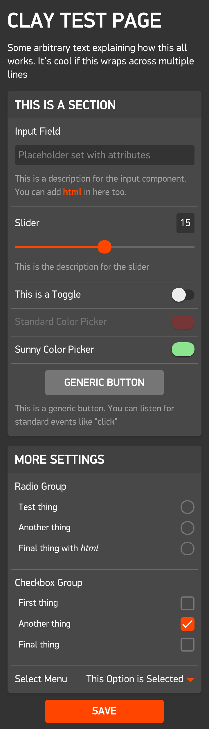 ### Section
Sections help divide up the page into logical groups of items. It is recommended that you place all your input-based items in at least one section.
##### Properties
| Property | Type | Description |
|----------|------|-------------|
| type | string | Set to `section`. |
| items | array | Array of items to include in this section. |
##### Example
```javascript
{
"type": "section",
"items": [
{
"type": "heading",
"defaultValue": "This is a section"
},
{
"type": "input",
"appKey": "email",
"label": "Email Address"
},
{
"type": "toggle",
"appKey": "enableAnimations",
"label": "Enable Animations"
}
]
}
```
---
### Heading
**Manipulator:** [`html`](#html)
Headings can be used in anywhere and can have their size adjusted to suit the context. If you place a heading item at the first position of a section's `items` array then it will automatically be styled as the header for that section.
##### Properties
| Property | Type | Description |
|----------|------|-------------|
| type | string | Set to `heading`. |
| id | string (unique) | Set this to a unique string to allow this item to be looked up using `Clay.getItemsById()` in your [custom function](#custom-function). |
| appKey | string (unique) | The AppMessage key matching the `appKey` item defined in your `appinfo.json`. Set this to a unique string to allow this item to be looked up using `Clay.getItemsByAppKey()` in your custom function. You must set this if you wish for the value of this item to be persisted after the user closes the config page. |
| defaultValue | string/HTML | The heading's text. |
| size | int | Defaults to `4`. An integer from 1 to 6 where 1 is the largest size and 6 is the smallest. (represents HTML `
### Section
Sections help divide up the page into logical groups of items. It is recommended that you place all your input-based items in at least one section.
##### Properties
| Property | Type | Description |
|----------|------|-------------|
| type | string | Set to `section`. |
| items | array | Array of items to include in this section. |
##### Example
```javascript
{
"type": "section",
"items": [
{
"type": "heading",
"defaultValue": "This is a section"
},
{
"type": "input",
"appKey": "email",
"label": "Email Address"
},
{
"type": "toggle",
"appKey": "enableAnimations",
"label": "Enable Animations"
}
]
}
```
---
### Heading
**Manipulator:** [`html`](#html)
Headings can be used in anywhere and can have their size adjusted to suit the context. If you place a heading item at the first position of a section's `items` array then it will automatically be styled as the header for that section.
##### Properties
| Property | Type | Description |
|----------|------|-------------|
| type | string | Set to `heading`. |
| id | string (unique) | Set this to a unique string to allow this item to be looked up using `Clay.getItemsById()` in your [custom function](#custom-function). |
| appKey | string (unique) | The AppMessage key matching the `appKey` item defined in your `appinfo.json`. Set this to a unique string to allow this item to be looked up using `Clay.getItemsByAppKey()` in your custom function. You must set this if you wish for the value of this item to be persisted after the user closes the config page. |
| defaultValue | string/HTML | The heading's text. |
| size | int | Defaults to `4`. An integer from 1 to 6 where 1 is the largest size and 6 is the smallest. (represents HTML `